Brand guidelines
Our logo, colours and type, and how to use them.
Single files
Full-colour logo on Void #08070F
On this page
About Piniverse
Piniverse is a reputation platform for pin traders. Every trader gets one public rep card: their verified trades, the feedback other traders left them, and their badges, in a link they can send anywhere.
•
Category: pin trading reputation and community platform
•
Website: piniverse.app
•
Short links: piniverse.me
•
Company: Piniverse Inc.
Tagline (use as written):
Rep that travels with you.
One-line description (use as written):
One public rep card for pin traders. Every trade you've made, in a link you can send anywhere.
In running text, write the name as Piniverse: capital P, the rest lower case, one word.
The name must always be written exactly Piniverse. Never PINIVERSE, piniverse, PiniVerse, PinIverse, Pin-iverse, Pin iverse, Pinverse, Pin Universe or any other variation. The only exception is a web address, which stays as it is (piniverse.app, piniverse.me).
The wordmark sets "Pin" and "iverse" in two colours. That split belongs to the logo only: in text, the name is never split, coloured or styled in two parts.
The logo
The logo has two parts:
•
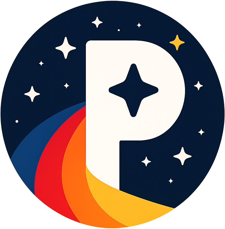
The mark: a night-sky disc with a ribbon of four bands sweeping round it, a P with a four-point star in its bowl, and a scatter of stars, one of them gold.
•
The wordmark: "Pin" and "iverse" in Space Grotesk Bold, tracked tight, outlined.
The horizontal logo (mark beside wordmark) is the primary logo. The stacked logo is for square and portrait spaces. The mark can stand alone where the name is already clear, such as an avatar. The wordmark alone is only for places too narrow for the mark.
•
You must use the supplied files (logo/, mark/, wordmark/). Never redraw the mark, retype the wordmark in a font, or put the mark and the wordmark together yourself.
•
Never stretch, squash, rotate, outline, or add shadows, glows or effects to the logo. The soft halo behind the mark in the site's header is part of the website, not the logo; never bake it into a file.
•
Never recolour any part of the mark, reorder its bands, or add, move or remove stars. The small mark (below) is the only version with fewer.
•
Never crop the disc or put the mark inside another shape. The app icon is supplied for that.
The mark
The wordmark
Stacked logo
Colour versions
Version
Use on
Files
Use full colour wherever you can. The mark is the same in both full-colour versions; only the wordmark changes, because Gold disappears on white.
The one-colour versions cut the P and the stars out of the disc, and the band edges out as fine gaps, so the ribbon still reads in a single ink.






Backgrounds
Background
Logo
Void
Full colour
Ink
Full colour
Panel
Full colour
Night
Full colour
White
Full colour, light
Moon
Full colour, light
Never use:
•
Gold, Flare, Nova or any other accent colour as a background for the logo.
•
Fog or any mid-tone background, or anything else where the logo has low contrast.
•
Busy photos without a dark overlay behind the logo first.
Ready-made 1920×1080 examples are in logo/backgrounds/.
Clear space and minimum size
•
Clear space: keep a margin of x on every side of the logo, where x is a quarter of the mark's diameter. Nothing else may sit inside it.
•
Minimum size: the horizontal logo 120 px or 30 mm wide; the mark 24 px or 6 mm across. Below that, use the mark alone at 24 px or larger.
•
The small mark: at 48 px and below, use mark/svg/piniverse-mark-small.svg. It is the same drawing without the four smallest stars and the two dots, which turn into noise at that size. The favicons are made from it.
x = ¼ of the mark
48 px
32 px
24 px
Motion
The animated mark twinkles its stars. Nothing else in the logo ever moves.
•
Stars: each one fades to 30% and back, once every 4 s, eased in and out. They are staggered so that no two neighbours peak together.
•
The P, the bands and the disc: never move, spin, bounce, pulse or change colour.
•
Start: every star at full brightness, as in the still files.
•
Reduced motion: if the viewer has asked for reduced motion (prefers-reduced-motion: reduce), don't animate. Show the still mark.
Use the supplied files in animated/. SVG animation only runs in web browsers; image viewers and design tools show the still mark.

App icon and favicon
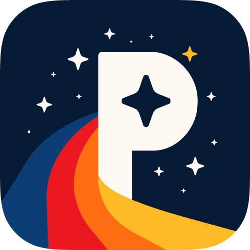
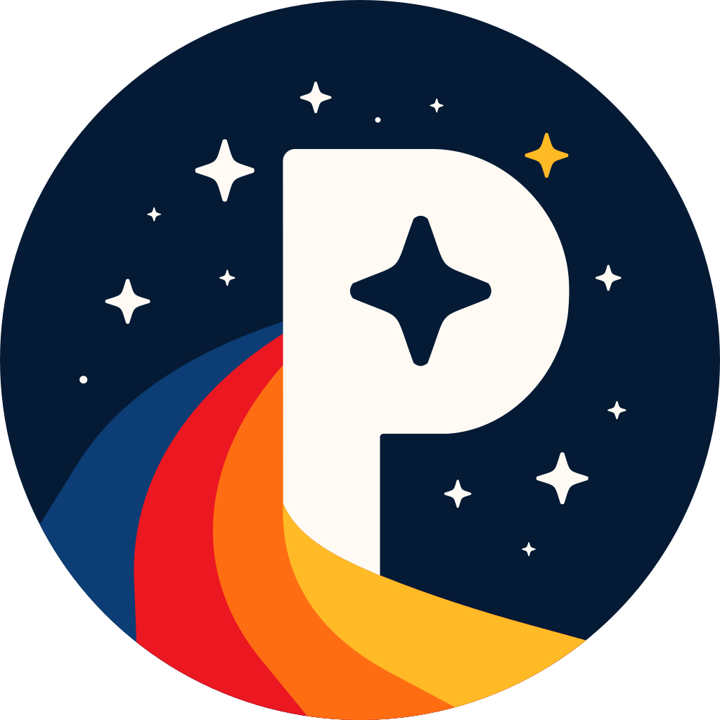
In the app icons the disc goes: the night sky fills the whole icon, and the ribbon runs out to its edges. The icon comes in three shapes, each as SVG and as 1024 and 512 px PNGs in icon/:
•
Rounded square (icon/piniverse-app-icon-rounded-1024.png): iOS's outline, with its continuous corners.
•
Round (icon/piniverse-app-icon-round-1024.png): for anywhere icons are circles.
•
Square (icon/piniverse-app-icon-square-1024.png): uncut and opaque, for anything that cuts its own shape from it. This is the one to upload wherever an app icon is asked for.
Never round, crop or add a border to an icon yourself: pick the shape. Android's adaptive icon layers are in icon/android-adaptive/.
Favicons (icon/favicon/): favicon.ico (16, 32 and 48 px), favicon.svg and PNGs at 16, 32 and 48 px, all made from the small mark; apple-touch-icon.png at 180 px; and 192 and 512 px icons, plus a maskable 512 px icon, for web app manifests.
Avatars: use the mark (mark/png/piniverse-mark-1024.png). Platforms that crop avatars to a circle will cut exactly along the disc.

Colours
The mark's colours
These are fixed. They only ever appear together, in the mark. They are not an interface palette.
Night
The sky in the mark; the logo on light backgrounds
Starlight
The P and the white stars
Orbit
Outer band
Comet
Second band
Ember
Third band
Sunburst
Inner band and the gold star
Click a colour or a value to copy it.
Interface colours
The website and the apps are dark only. There is no light theme.
Void
Page background
Ink
Footers and deep panels
Panel
Cards and sheets
Line
Borders and dividers
Fog
Body text on dark
Moon
Headings on dark
Gold
Primary accent; "iverse" in the wordmark
Nova
Accent
Flare
Warnings, errors and negative rep
Azure
Information
Mint
Success and positive rep
Deep Gold
"iverse" in the wordmark on light backgrounds only
Click a colour or a value to copy it.
For print, convert from these values and proof before printing. The CMYK values on /brand and in the PDF are straight conversions, not a print profile.
Typography
•
Space Grotesk for headlines, interface and body text, and the wordmark.
•
Bold for headlines and the wordmark.
•
Medium for labels, buttons and emphasis.
•
Regular for body copy.
•
Instrument Serif Italic for taglines and pull quotes only, never body text.
•
JetBrains Mono for small labels, numbers and codes.
•
Regular, and Medium for emphasis.
•
Headlines: short, in sentence case, tracked -0.025em.
•
Body text: Regular, about 1.6 line height. Use Fog on Void, or Night on light backgrounds.
Getting the fonts
All three are free and open source under the SIL Open Font License 1.1: use them in print, on the web and in apps, commercial work included, and embed them in documents and software. The one thing the licence rules out is selling the font files on their own.
Font
Weights used
Download
•
You don't need any of them to use the logo: the wordmark in the files is outlined, so it looks the same everywhere.
•
If you pass the font files themselves on, pass their licence (OFL.txt) on with them.
•
Never substitute another face. If a font can't be loaded, fall back to the system sans-serif or monospace, never to a different display face.
Disney and other trademarks
Piniverse is independent. It is not affiliated with, endorsed by or sponsored by The Walt Disney Company.
•
Never use Disney characters, castles, parks, logos or the Mickey silhouette in Piniverse brand material, and never suggest that Disney endorses Piniverse.
•
Pins traded on Piniverse can be shown as they are, as pins. Never combine a pin's artwork with the Piniverse logo so that the two read as one design.
•
Notice line: use this wording exactly, in a footer, legal page, back page or end credits, on anything that shows Disney pins:
Piniverse is not affiliated with The Walt Disney Company. Disney artwork, copyrights, and trademarks belong to their respective owners or licensors.
•
Never change the wording.
Files in this pack
Path
What it is
These guidelines, as a visual document
These guidelines, as text
logo/svg/
Horizontal logo in all five colour versions
logo/png/
Transparent PNGs, 1000, 2000 and 4000 px wide
logo/stacked/
Stacked logo, SVG and PNG, all five colour versions
logo/backgrounds/
1920×1080 logo on each allowed background
mark/svg/
The mark in full colour, white, Night and black, and the small mark
mark/png/
The mark at 256, 512, 1024 and 2048 px
wordmark/
The wordmark alone, SVG and 2000 px PNG, all five colour versions
icon/
App icon as a rounded square, round and square: SVG, and 1024 and 512 px PNGs
icon/android-adaptive/
The app icon as Android adaptive icon layers
icon/favicon/
Favicon and web app icon files at standard sizes
Animated mark, for the web (browsers only)
Animated horizontal logo, for dark web pages (browsers only)
Piniverse
“Rep that travels with you.”
One public rep card for pin traders. Every trade you've made, in a link you can send anywhere.
Legal
Piniverse Inc.
Suite #8906
2093 Philadelphia Pike
Claymont, DE 19703